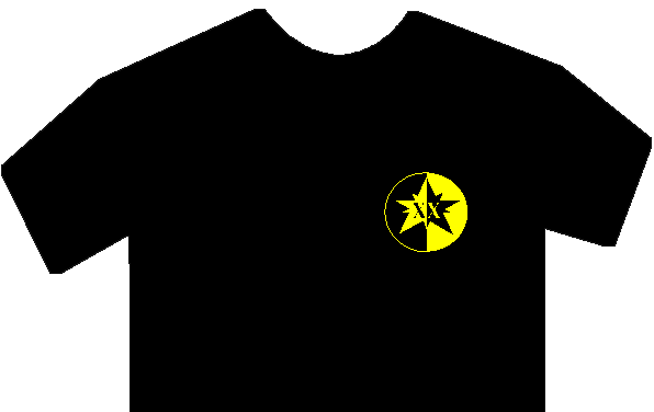
This page was created as a personal visual aid for the proposed ATYC T-Shirt bid. There has been some concern that a black and gold logo on a black t-shirt will not look good. I wanted to get an idea of what one MIGHT look like. Keep in mind that this is NOT representative of what the final shirt will look like. I REPEAT, I am in no way responsible for the design or any other aspect of this project and make no claims that this is even close to what they might look like. There may be words added, placement changed, etc. This is simply an aid to my own color visualization.
The advantage of using a black t-shirt, of course, is that we would only need one imprint color and therefore reduce our cost substantially. Personally, I think it looks pretty good, but then again my opinion is worth what you paid for it.
This page viewed times.